








Design systems: creating uniformity across your digital platforms
Writer :By: Admin
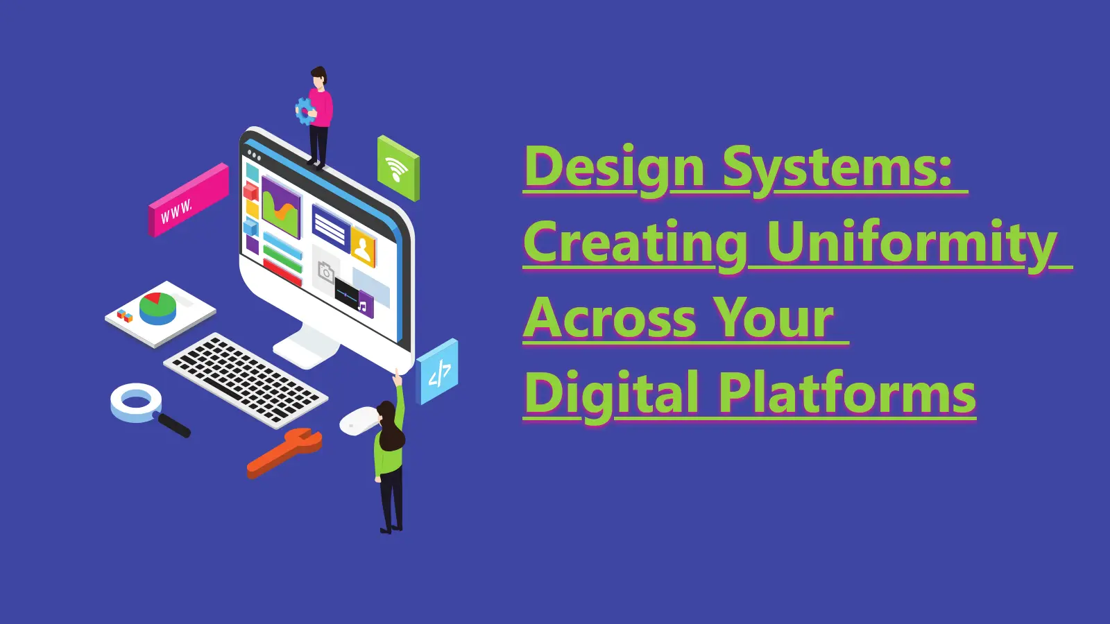
When you manage more than one digital product, consistency becomes a technical problem. Different teams, evolving requirements and tight deadlines lead to fragmented user interfaces. A design system addresses this by creating a single source of truth: a library of reusable components and clear standards that you can assemble to build any number of applications.
## What is a design system? A design system is more than a style guide. It is a collection of reusable, functional components, patterns and guidelines, often packaged as a code library. It defines not just the colour of a button but its states, its accessibility attributes and how it behaves on different screen sizes. It is a product in itself, serving your internal design and development teams.
The main trade-off is the upfront investment. You are front-loading design and engineering decisions that would otherwise be made ad-hoc during a project. This requires dedicated time and resources, which can feel like a slowdown before it becomes an accelerator. Without commitment to adoption and maintenance, a design system becomes expensive shelfware.
## The components of a functional system A design system is built from several connected parts. Each part serves a different purpose for your designers and developers.
### Design principles These are the foundational rules that guide the system. They are clear, concise statements that help your team make decisions. For example, a principle might be "clarity over density" for an application that handles complex data, or "one primary action per screen" for a mobile app focused on transactions.
### Style guide This defines the visual identity. It includes your colour palette, typography scales, spacing rules, iconography and use of motion. It provides the visual language that makes your components look like they belong together.
### Component library This is the core of the system. It contains the reusable UI elements like buttons, forms, navigation bars and cards. Each component is designed, built and tested to be robust and accessible. For developers, this is often a package they can install and use directly in their projects.
### Patterns and layouts Patterns are reusable solutions to common design problems, like user onboarding or data filtering. They show how to combine multiple components to create a coherent user experience. Layout guidelines define the grid and structure for arranging content on a page.
## The benefits and the costs Adopting a design system introduces specific efficiencies and new challenges. It is not a universal solution, and its value depends on your context.
### Benefit: speed Once the system is mature, you can assemble new features and products from pre-built blocks much faster than building from scratch. The cost is that initial development of the system itself is slow. You are building infrastructure, not shipping features.
### Benefit: consistency Users get a familiar experience across all your platforms, which reduces their cognitive load. We saw this with a real-estate association platform, where consistent forms and search results were needed across both public and member-only sections. The cost is that a design system can discourage creative or novel solutions that fall outside its rules.
### Benefit: quality Components are built once, reviewed for quality and tested for accessibility. Every team that reuses them benefits from that work. For an educational platform we built, this meant accessibility for components was handled centrally, not per-project. The cost is that a bug in a core component can propagate across all applications that use it.
How we build and adopt a design system
### 1. Conduct a UI audit We start by inventorying the existing UI across your products. We collect every instance of a button, form field and colour. This visual audit reveals inconsistencies and forms the basis for deciding which components to build first.
### 2. Establish design principles We work with you to define a small set of guiding principles. These are the tie-breakers for future design decisions. They connect the design system back to your product goals.
### 3. Build the core components We do not try to build everything at once. We identify the most frequently used and critical components—like buttons, inputs and typography—and build those first. This creates immediate value for a pilot project.
### 4. Document everything For a component to be used, it must be discoverable and understandable. We write clear documentation for each component, explaining what it is for, how to use it and what its technical properties are. Without documentation, the system will not be adopted.
### 5. Create a governance model We help you define a process for how the system will be maintained. This includes who can contribute, how changes are reviewed and approved and how updates are released to consuming projects.
## Maintaining a living system A design system is never finished. It must evolve with your products and technology. A system that does not change is a system that is dying. Maintenance requires a dedicated team, even if it is small. Their job is to support users, fix bugs and add new components or patterns as required.
We have seen this in our work with clients in e-commerce and community management. As new user needs emerged, the design system had to accommodate new types of content and interaction. A food ordering platform, for example, required different card components than a legal management system. The maintenance process allowed the system to adapt without breaking.
## Conclusion A design system is a tool for creating consistency at scale. It requires a deliberate investment of time and resources, both to create and to maintain. When implemented with a clear process and a pragmatic approach, it provides a solid foundation for your digital products, allowing your teams to build better experiences, faster. It is not a one-time project but an ongoing commitment to quality and efficiency.